


BRAND STRATEGY
Our brand strategy is a long-term plan that defines how we position ourselves in the market and connect with our target audience.
It outlines the brand's identity, values, and messaging, and guides all marketing and communication efforts.
This section contains all the brand value propositions and category descriptions
Brand Name
BRAND STRATEGY
We have a new name. We have shortened our name to Cactus. Our new name and wordmark embodies this transformation, featuring a sprouting leaf that symbolizes our continuous growth, and also why we have kept our existing cactus logo.
Like the resilient cactus, we are adaptable, robust, resourceful, and thrive amidst adversity.
Over the past 15 years, we have carefully cultivated our DNA, embracing independence, innovation, and inclusivity. Having been part of the transformative power of technology, people, and skills, we are ready to make a change for ourselves.
We are Cactus

Brand House
The Brand House contains the building blocks and foundation for any key brand messaging. Every piece of content can find its roots in the brand house.
BRAND STRATEGY

Brand Promise
BRAND STRATEGY


Embarking on a new era of innovation, we introduce Accelerative Innovation as our core proposition, empowering businesses to navigate the ever-accelerating pace of innovation.
Strategic Narrative
BRAND STRATEGY
We combine human expertise and AI-powered software solutions to help businesses accelerate innovation.
Our team of experts has deep experience in a wide range of industries and technologies. We help businesses identify and prioritize their innovation needs, develop and implement innovative solutions, and measure the results of their initiatives.
We leverage software and AI to help businesses innovate faster and more efficiently than ever before.
Accelerate Innovation
Through Human Expertise
and AI
Brand DNA
BRAND STRATEGY
Cactus + AI
People. Skills. Experience
Accelerative Innovation
Our DNA seamlessly integrates human expertise with AI-powered software solutions, combining the key strengths of our people, experience and skillsets and our focus on accelerative innovation.
Vision
BRAND STRATEGY
Vision
To make software that matters, we accelerate innovation that lasts.
Campaign message
BRAND STRATEGY
‘No time to lose’ is our campaign message. It relatesto our Accelarative Innovation narrative as a motivating, positive Call to action message.
It is not to create uncertainty or fear. This is not the context of our strategic narrative.
We will use ‘No time to Lose’ as both an external GTM marketing message as well as rallying cry for all our internal activities.
Employee Values
BRAND STRATEGY
Our Employee Values
These are the values that we live and work by. Throughout our history we have always had an international view on the way we do things.
Innovation has always been a part of our DNA, now with our new strategic narrative it becomes central in what we believe in.
We have always been responsive and caring for every client - its our way we serve and deliver. Independence is how we choose to act and run our company.
International
We are a team of global citizens who embrace diversity, resourcefulness, and transparency - driven by our culture for innovation.
Innovative
Our nature is to innovate, fueled by curiousity, and a relentless pursuit to find new ways to solve problems using human expertise and technology.
Independent
Our independent spirit empowers us to be agile and responsive to accelerate the digital ambitions of our customers.
Brand Tone of Voice
BRAND STRATEGY
Tone of voice
Cactus speaks directly to its audience in an encouraging and friendly manner. We are here to help promote innovation and integration.
Our brand promise ‘Accelerate Innovation’ is first and foremost motivational, while ‘No time to lose’ should be seen as positive encouragement.
Our communication style is thoughtful, clear and supportive. We strive to create a longer term relationship with our network so every communication must enrich, empathize, and inspire the conversation.
Our tone is a reflection of our independent, easygoing, and highly collaborative culture. We listen to and respect each other’s.
Examples
Job vacancy
No Time to Lose in your career.
Join Cactus now @ Cactus.now
Onboarding
A new Innovator joins Cactus.
Eric Camargo, joining us as a Project Manager.
Expertise article
Accelerate your knowledge on how to design, build and implement your next software development.
Get-together events
Global citizens of Cactus you are invited to the next Meet-up!
Note!
When writing a document, choosing the name of an event or even making a decision, ask yourself;
Does it feel inclusive, innovative and does it communicate our own independent spirit.
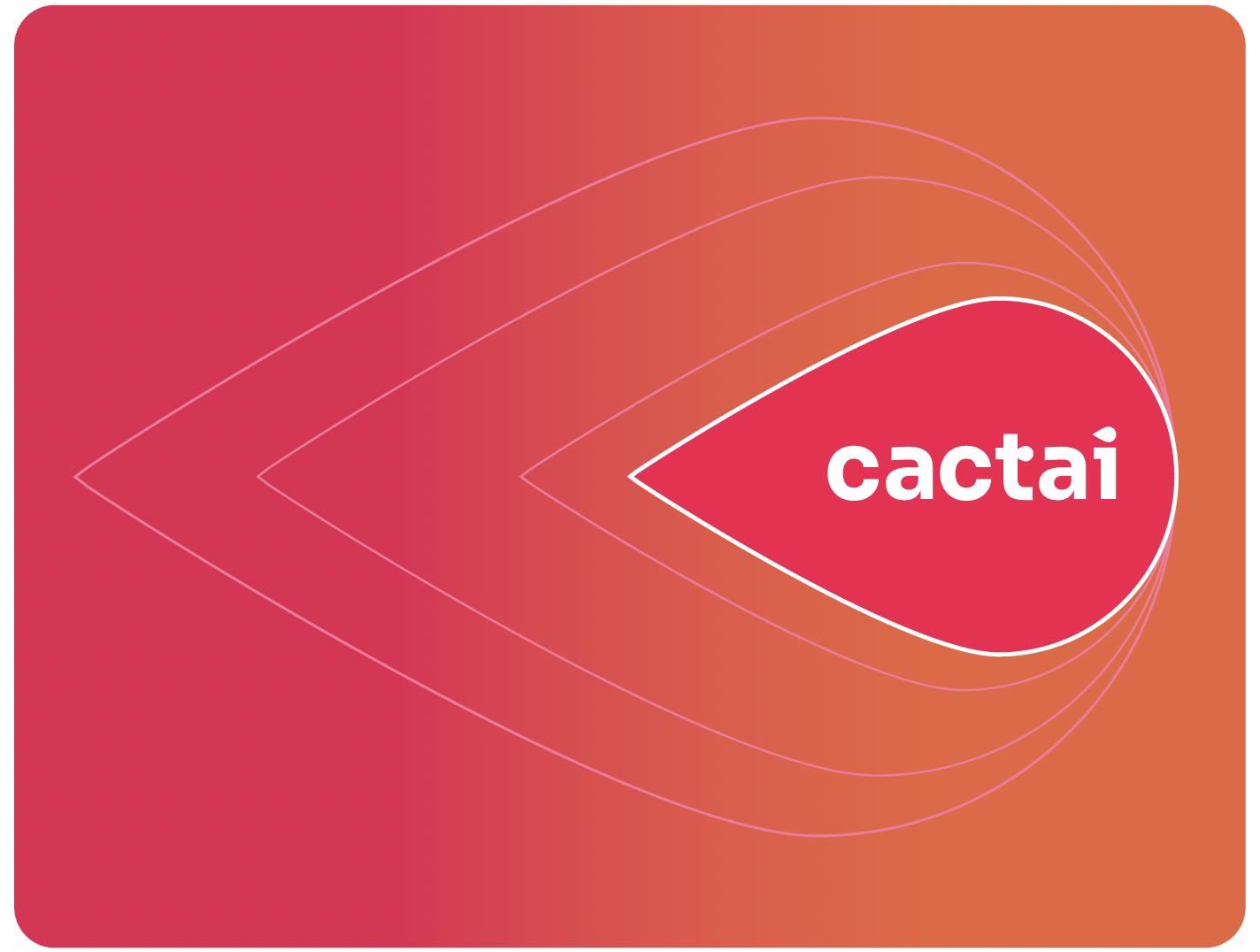
Cactai
BRAND STRATEGY
Cactai is our ‘special forces’ team - a new proposition within Cactus that pioneers groundbreaking solutions, empowers clients with cutting-edge tools and knowledge.
Cactai kickstarts a new era for Cactus, fueled by our unwavering belief in the transformative power of Cactus + AI.’
With Cactai we are embracing accelerative innovation as the cornerstone of everything we do.
BRAND IDENTITY
A brand visual identity is the collection of visual elements that represent a brand, including its logo, colors, typography, and imagery.
These elements work together to create a consistent and recognizable brand image that helps to establish the brand's personality and differentiate it from its competitors.
This section contains all the brand design elements and guidelines.
Brand name/wordmark
BRAND STRATEGY
Wordmark specifications
The new wordmark signifies the ‘new leaf’ of our new strategic offer.
The letters and the ‘t’ in the text have been adapted from Sora to create a new look for Cactus representing our new offer
(Cactai) and new service growth.
Where ever possible use the logo in the main brand red colour.
This brings recognition and awareness to the Cactus brand.
Note:
The wordmark can be used independently of the brand (cactus) logo. They do not need to be used together at all times.

Brand logo
BRAND STRATEGY
When using the signifier, it is not mandatory to use the brand name (wordmark.) It can be used independently.
The logo is a representation of our three service propositions:
Accelerative
Innovative
Integrative
Note: When using the logo on the red or orange background a white line must be applied to define its edges. The thickness of the line is dependent on the size and background usage.
Full Logo
BRAND STRATEGY
Name and Logo
The name and logo can also be used in a horizontal position.
Also included is the brand descriptor. It can also be used without the brand descriptor, especially when used small.
Alignment
The name and logo are used centred. The relationship and size of the name and logo is based on the total length as a full length brand wordmark.
Black and White
Black and white has two versions.
Shown are the full black and percentage black versions.
Brand usage
BRAND STRATEGY

The rules for using the name and logo together are not fixed.
The usage of the name and logo separately is welcomed - even preferred.
It also depends on the context of the content, how it is used and what fits best.
Cactai signifier
BRAND STRATEGY
The Cactai logo is our special logo for the new AI development team. This logo should only be used for these activities and not be used together with the Cactus logo.
Note:
When using the logo on the red or orange background a white line must be applied to define its edges. The thickness of the line is dependent on the size and background usage.
Main colours
BRAND STRATEGY
Main colours
The main brand colours are:
Red
This has been chosen for its warmer tone and readability on screen. It derives from the original red from the previous housestyle. Its closest pantone colour is PMS 192.
‘Seville’ Orange
This brighter orange is part of our new direction.
Supporting colours
White
Black
Within the logo are 3 shades of the main red colour.
These have unique colours. They not percentages of the red. They can be used in backgrounds when necessary.
Red PMS 192 (similar)
RGB: (247,7,77)
CMYK: (0,97,69,3)
HEX: #F7074D
HSL:342.5,94.5%,49.8%
Orange PMS 2026
RGB: (244,99,58)
CMYK: (0,59,76,4)
HEX: #f4633a
HSL: 13*, 89%, 59%)

Colour gradient
BRAND IDENTITY
The colour gradient is built up of the two main brand colours, Red and Orange.
The primary direction is from left (orange) to right (red)
The direction of the gradient can be used left to right or right to left depending on the usage.
The gradient is a linear gradient and should only be used this way.

Sora font
BRAND IDENTITY
Typography
The main font is Sora.
Sora is a Google font easliy accessible to download useable across many platforms.
The brand wordmark uses the Sora Bold version.
The Sora Font
The big x-height makes this font a convienient tool for app and web interfaces, where clarity and effectiveness at any size is imperative.
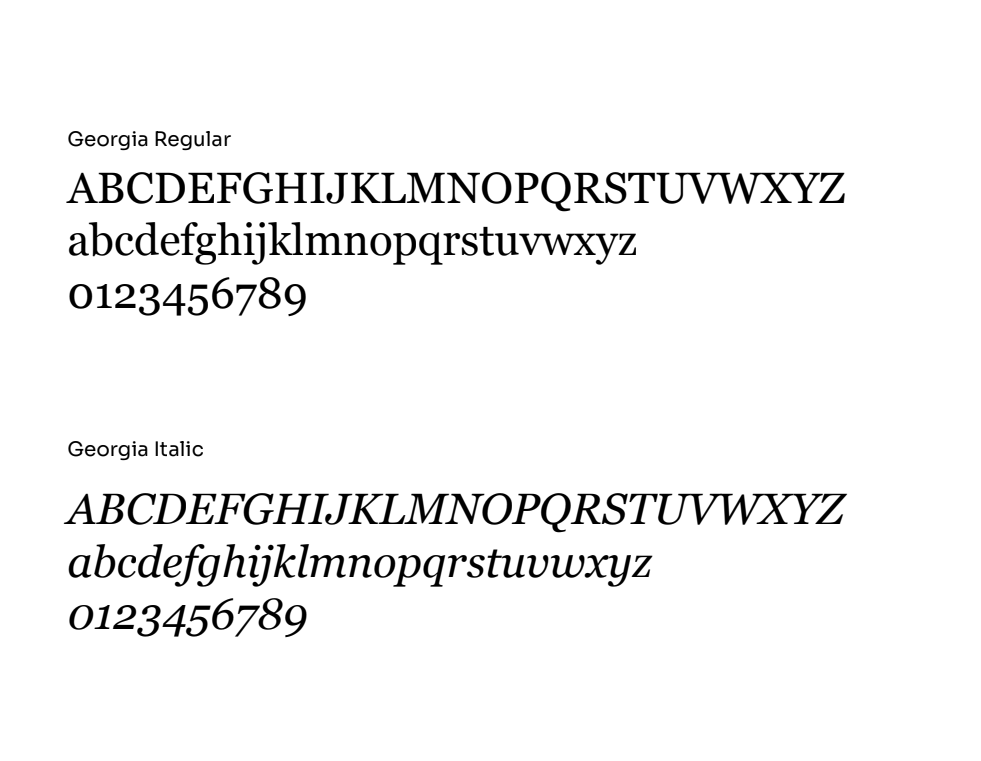
Georgia font
BRAND IDENTITY
Secondary Font
The secondary font is Georgia. Georgia is a Google font easily accessible to download useable across many platforms.
The Georgia Font
This font should be used for long read texts, quotes and highlighting and special content that needs to stand out.
Georgia is a serif font, designed to be read easily so perfect for long texts such as case studies or white papers.
Georgia is not to be used in titles or sub-headings.
Typography hierarchy
BRAND IDENTITY
Type examples
For Titles: Sora Medium
For Subtitles.
1. Sora Bold regular is used for subtitles
For body copy
Sora Medium is used for all body copy.
For secondary body copy
Georgia Regular is used for highlights in the body copy.
Note!
All fonts are used in their standard leading version.
There is no need for letter spacing.
Typography examples
Using colour in typography
The use of colour in typography is important both for readability and brand recognition.
Warm Red is used for stand out texts and highlights.
Purple and black can be used primarily for body copy.
Note:
When using text on these backgrounds please follow WCAG (Web Content Accessibility Guidelines) for accessibility and readability.
This ensures that content is accessible by everyone, regardless of disability or user device.
BRAND IDENTITY

Illustration style
Illustration style
Abstract imagery
We use abstract imagery in backgrounds
to reflect our innovative nature.
They represent growth, dynamism, computation, expressing that they have been made by humans with AI fitting with our DNA.
We also use our cactus wallpaper
- for special occasions
These images have been made in Abode Firefly - Adobe’s latest AI graphics software.
These are just a few examples.
BRAND IDENTITY

Photography Style
BRAND IDENTITY
People images
We always shoot our people in the most natural environment. We do not like posed or official photos as that does not reflect our employee values.
Client images
We try to use as much as possible to reference our client stories with images that express their industry. While these might not come from the client themselves, there are plenty of stock related photography that can be used.


Terms and Conditions
BRAND IDENTITY
Terms and conditions are to protect your brand from misuse and copyright.
1. Cactus marks are our most valuable assets. These Trademark Guidelines (“Trademark Guidelines”) are intended to preserve the value attached to the Cactus Marks. “Cactus” include Cactus’s trademarks, trade names, brand tag lines, service marks, service names and logos, web pages, screenshots, brand features, or any word, phrase, image, or other designation that identifies the source or origin of any Cactus products or services.
2. Subject to the compliance with the Trademark Guidelines, Cactus permits its customers, third-party developers, partners, and the media (“you”) to use the Cactus Marks solely in connection with advertising, promotion, distribution, or sale of the Cactus products.
3. Except for the limited permission specified herein, nothing in the Trademark Guidelines shall grant or be deemed to grant you any right, license, title or interest in or to any Cactus Marks.
4. Cactus Marks are protected by various intellectual property laws in Europe and worldwide. You acknowledge and agree that Cactus and its affiliate retain any and all intellectual property and other proprietary rights in and to the Cactus Marks. All use by you of the Cactus Marks including any goodwill associated therewith, shall inure to the benefit of Cactus. You shall at no time contest or aid in contesting the validity or ownership of any Cactus Mark or take any action in derogation of Cactus’s rights therein.
5. You shall use the Cactus Marks only in compliance with all applicable federal, state, local, and foreign laws and regulations.
6. You shall not display the Cactus Marks in any manner that is misleading, unfair, defamatory, infringing, libelous, disparaging, obscene or otherwise objectionable. You agree to supply Cactus with samples of your use of the Cactus Marks upon request.
7. Your limited permission to use Cactus Marks shall terminate immediately (a) upon expiration or termination of your agreement with Cactus or (b) if you engage in any conduct which in the opinion of the Cactus, is detrimental to the Cactus Marks or to the goodwill connected with them (c) if you fail to comply with Trademark Guidelines or (d) at any time in Cactus’s sole discretion for no reason. You shall immediately cease using Cactus Marks upon such termination.

The Cactus Brandbite guide has been developed to bring all your brand needs into one place.
Should you need further help with your brand needs please contact alejandra.ruiz@cactussoft.biz